- Author: Eich Eyf
Date: May 13, 2022 - Category : 3D Animation


![Color In Character Design [2025 Guide for Memorable Palettes]](https://buzzflick.com/wp-content/uploads/2022/05/How-character-color-palette-can-make-or-break-a-character-design.jpg)
Color can turn a good character into a memorable one. Before a viewer reads dialogue or hears a voice, they notice color.
From animation studios to indie illustrators, designers use color in character design to express mood and psychology. A smart character color palette helps your design stand out in a crowded visual world.
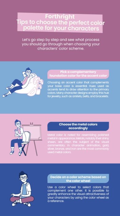
A well-structured character color palette defines how a character feels and reads on screen. Using the 60-30-10 color rule theory in character design, you can create emotionally resonant visuals that fit the story and capture attention instantly.
This guide breaks down the theory of color in character design in a way that actually makes sense. You’ll learn how to build balanced palettes that keep your characters expressive.
Every great character starts with a silhouette. But color brings that silhouette to life. It signals personality, emotion, and narrative purpose before a single frame of animation moves.
Color in character design builds three things every character needs:
The importance of color in animation lies in its ability to set mood and signal character traits. Without intentional color choices, even the most technically perfect design can feel flat.
A strong character color palette supports story, complements silhouette, and enhances emotional readability; the trio that makes good characters great.
According to a psychological study,
“Our subconscious mind is adept at making up meanings from different colors. If the colors evoke a sense of dislike, we won’t be happy looking at them.”
Color also shapes hierarchy and recognition. When viewers spot Iron Man’s red-gold suit or Harley Quinn’s blue-pink contrast, they recognize them instantly. These designs work because color does more than decorate; it identifies.
Color psychology in character design helps you control how people feel about your character. Every color says something. This is why brands, filmmakers, and game studios use color for personality.
Here’s a summary (2025 data from Adobe’s Design Insight Report:
| Color | Emotional Signal | Common Character Use |
|---|---|---|
| Red | Passion, strength, danger | Warriors, rebels, heroes |
| Blue | Calm, wisdom, loyalty | Leaders, mentors |
| Green | Growth, balance, envy | Nature roles, rivals |
| Yellow | Hope, energy, curiosity | Sidekicks, innovators |
| Purple | Magic, mystery, power | Royalty, mystics |
| Orange | Warmth, spontaneity | Adventurers, performers |
| Black | Authority, darkness | Villains, leaders |
| White | Simplicity, purity | Healers, spirits |
Understanding these associations helps designers use color in character design intentionally. When creating character design, considering psychology ensures your characters resonate instantly. You can follow or play against expectations, but doing so requires awareness.
Color does more than fill shapes. It tells the viewer how to see a character.
In short, color adds depth that line art alone can’t achieve.
Designers often rely on the 60-30-10 color rule to bring balance to complex visuals.
This rule works because it creates order. Too many equal colors compete for attention. Too few make a character feel unfinished.
Example workflow: A cyber hero might use:
Test the palette with animation tools like Figma Color Styles and Adobe Firefly Palettes let you test these ratios dynamically, even simulating how they appear on HDR and OLED screens.
Pro tip: Test your palette in grayscale first. If it still reads clearly without color, you’ve nailed the contrast.
Let’s make this practical. Here’s how professionals build a palette from scratch for color in character design.
Write down their role, emotion, and environment. Ask yourself: What feeling should this character instantly give off?
Choose the color that expresses their core trait: courage, mystery, warmth. This takes up around 60% of the design.
Use a complementary or analogous color to balance the main hue. This adds depth and prevents monotony.
This is where your personality shows. The accent (a stripe, glow, or accessory) guides attention and adds life.
Check how your palette performs in 3D animation, motion graphics, and mixed-lighting scenes. Make sure the palette holds up under all lighting conditions.
Color meanings change between regions and genres. A palette that works in a fantasy might feel off in sci-fi. Always review your choices against the story’s tone.
Record hex and RGB values. Keep a style guide so the palette stays consistent across animation, marketing, or game interfaces.
Modern animation studios use evolving palettes to track story progression. As characters grow or change, so does their color story.
When your palette evolves alongside emotion, it becomes visual storytelling.
If you want your palette to feel unique, think beyond “favorite colors.” Start with the story and build from intent.
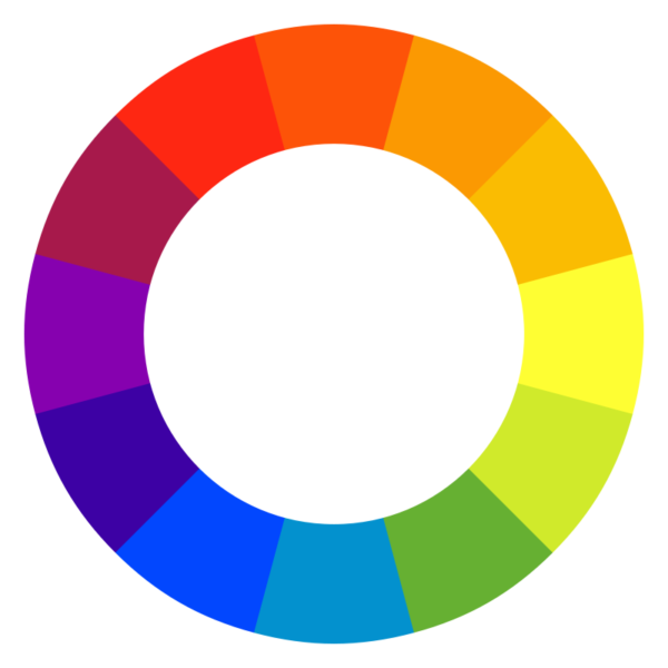
Image Source: Wikipedia
Here’s how pros do it:
Your palette isn’t just decoration. It’s narrative shorthand.
Even skilled artists fall into traps. Here are the most common ones:
Simple rule: if a color in character design doesn’t serve the story, remove it.
Design trends evolve just like fashion. Here’s what color in character design is hot this year:
Color is language. Every tone says something about your character before a single word appears. When you use it with purpose, your characters feel alive, intentional, and memorable.
Great choice of color in character design isn’t about guessing the right shade. It’s about understanding why that shade works for the story and for the emotion you want your audience to feel.
At BuzzFlick, we start color planning with purpose. Every project gets a palette that supports emotion first, not trend. That’s why our designs feel natural and consistent. If you don’t want to go into the complexities and still get your work done, reach out.
Color theory in character design is about how colors work together to build emotion and personality. It helps you decide which hues fit a character’s role and story. Once you understand it, your color choices stop being random guesses and start feeling like part of the storytelling itself.
Colors in character design convey personality, mood, and role. Red signals courage or passion, blue shows calm or loyalty, green reflects nature or envy, yellow evokes optimism, and purple suggests mystery or magic. Proper combinations help audiences instantly understand a character’s traits and emotional tone.
This approach focuses on calm balance. Seventy percent neutral tones, twenty percent supporting color, ten percent accent. It’s often used when a design needs subtlety or realism. This ratio makes your character readable and steady while still keeping highlights that catch attention in the right places.
Red-blue, blue-yellow, green-purple, and complementary warm-cool contrasts dominate. Balanced palettes often follow the 60-30-10 rule, combining a dominant color with supporting and accent hues to enhance readability, emotional impact, and visual appeal in animation.
Here is an overview of the history of animation and the 14 interesting facts about animations for animation lovers, Enhance your animation knowledge instantly.
Read More
Get A Custom Quote Now
Copyright © Buzzflick 2026, All Rights Reserved.
Get Video Animation at Reasonable Prices at BuzzFlick! Get A Quote!
