In video creation and movies, color is one of the significant elements that help shape the video’s theme. If your color selection for the video is unsuitable, it can fail to capture the audience’s attention, or they will not understand your message.
So, we cannot ignore the significance of colors in animation. Choosing attractive colors that can make your video animation more creative and help get viewers’ attention is essential.
Some people think it is essential to choose the color that matches their logo, or it requires the designer and artistic skills to pick the most attractive colors in videos.
If you want to make your video highly engaging, it requires an understanding of color theory.
Why is Color Theory Important for Video Makers?
Color theory has a rich history associated with it, which includes the practice of combining and mixing colors during the Renaissance period. Isaac Newton and Leonardo da Vinci later contributed to the color theory and made it easy for people to understand.
In the early 20th century, Albert H. Munsell created a color theory system containing chroma, lightness, and shade that helped people understand the science of colors.
Color theory doesn’t include the hard and fast rule. Still, it is crucial to know the color theory basics that give you an idea to use the right color combination and the emotions and moods colors can trigger.
Sir Isaac Newton’s Color Wheel Theory
In 1666, Sir Isaac Newton created this diagram to explain colors which helped people to know about colors. It benefited the art students, animators, artists, and graphic designers.
the significance of colors in animation. Choosing attractive colors that can make your video animation more creative and help get viewers’ attention is essential.
Some people think it is essential to choose the color that matches their logo, or it requires the designer and artistic skills to pick the most attractive colors in videos.
If you want to make your video highly engaging, it requires an understanding of color theory.
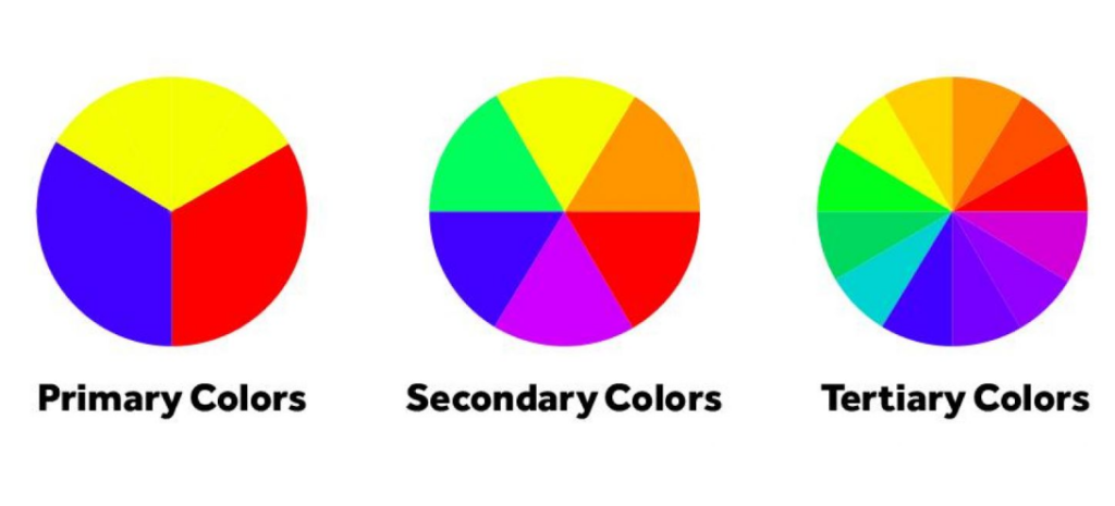
Primary Colors
Old color theory categorizes primary colors which contain blue, yellow, and red. Whereas various colors originated from these primary colors, these colors are not formed by blending additional colors.
Secondary Colors
Purple, orange, and green colors are secondary colors. Secondary colors are formed when we blend primary colors.
Tertiary Colors
Tertiary colors include six colors, and we create them when we blend a secondary and primary color. This combination comprises red-orange, yellow-orange, blue-purple, red-purple, yellow-green, and blue-green.
Image of Johann Wolfgang von Goethe’s color wheel and Adobe’s modern color wheel.
We have categorized the colors in the light of the color wheel. Munsell’s color system described the following color segments:

The Standard Color Systems
The standard color systems people use are CMYK and RGB. Both systems contain various secondary, primary, and tertiary colors. RGB includes blue, green, and red as its primary colors. Magenta, yellow, and cyan come in secondary colors.
RGB was mainly preferred for visuals like mobile screens, televisions, LCDs, LEDs, and hex code represent it. People use hex codes to signify colors. These codes help us in classify color.
People use the CMYK color system only for printing.
It contains primary colors of black, magenta, yellow, and cyan, whereas secondary colors are blue, green, and red.
When we mix primary and secondary colors in CMYK and RGB systems, it creates tertiary colors.
Categorization of Cool and Warm Colors
This picture of the color wheel categorizes the cool and warm colors. Red/yellow colors signify warm colors, whereas the blue/green side shows cool colors. Check out the picture below to understand various colors’ cooler and warmer shades.
You can use cool and warm colors in combination. However, it is preferred not to use too many cool and warm colors; it makes the visual unattractive.
It is ideal for incorporating two to three colors to create a perfect combination.
Preferred Color Schemes
The first step in creating a video is choosing the right color combinations that make the video attractive. Ensure not to use boring, dull, chaotic, or unpleasant colors.
As a video creator, you should follow the color theory in your videos. Every video producer wants the animation, images, and text to look visually appealing against the background. It makes your video attractive.
The pro tip is that avoiding bright colors and chroma is better because viewers feel such colors irritating to their eyes.
Here we will discuss the best tips for choosing the most appealing colors.
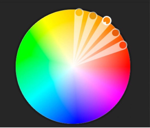
Analogous Colors
In the color wheel, analogous colors are put alongside every color. Analogous colors are connected with nature because they are eye-catchy and are ideal for capturing viewers’ attention.

Usually, analogous colors contain a dominant color and two other colors shown next to those colors in the wheel. The Red, orange, and yellow combination is the perfect example of these colors.
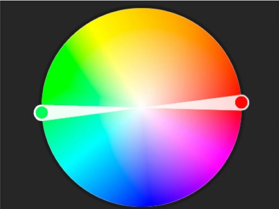
What are Complementary Colors?
When we see the color wheel, the complementary colors are shades shown in the opposite direction of each color. For instance, red and green are examples of these colors, and people avoid this color combination. Yellow and blue are other examples of complementary.

These colors are different from each other. That is why video creators and animators incorporate complementary colors in the video background and other colors to capture the viewers’ attention.
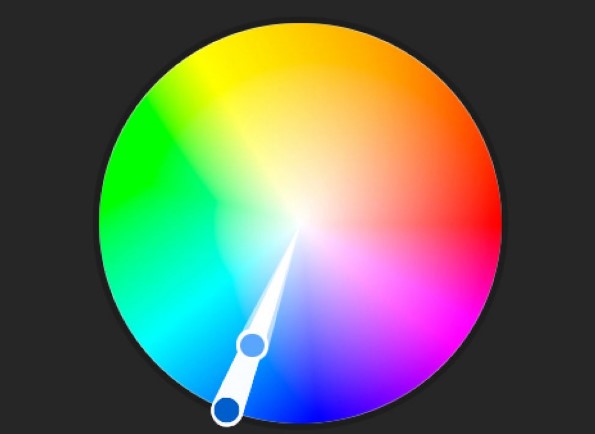
Monochromatic Colors
People use one base color with shades, tints, and tones of similar colors. The tint color reflects the white, and the shade contains black color, and the tone includes the gray color.
People use gray, white, or black colors to make the colors dark, light, or mute them to affect the color theme.

Viewers love monochromatic colors because they are visually appealing, but if you don’t incorporate them correctly, they fail to capture the viewers’ attention.
Triadic
You can create triadic colors by incorporating three colors. Moreover, you can obtain them from an equilateral triangle.
Animators and designers prefer triadic colors; they use one color in the background and two other colors to visualize content.
Psychological Impact of Color Theory
Animation experts and designers know very well that colors stimulate emotions in viewers. In various cultures, people use different colors to signify multiple meanings.
For instance, people use red color in American pop culture to symbolize villains. Moreover, it portrays passion, power, or anger. People in China use different colors to signify happiness and luck.
No rule explains the colors. However, people use warm colors to reflect happiness, passion, and strength. In contrast, cool colors show competence, trust, and calmness.
Many companies have a blue-colored logo, but most people think that the blue color represents sadness. It is better to research the culture and viewers for color selection.
When it comes to the best background color for a video, cooler shades are ideal. In comparison, you can use warm colors in the center to highlight something.
If you want to create an animated video. You should know the impact of colors on character design when creating an animated video.
Suppose you don’t have enough color knowledge and want to create an animated video. In that case, I recommend searching for the best animation outsourcing companies and picking the most experienced animation agency.
Incorporate Color Theory to make Videos Visually Appealing
The color selection depends on the video you want to create. Film producers incorporate lightning and various colors to build viewers’ interest in their movies.
If you want to create a video for your company’s marketing, avoid using bright colors and simple colors to make your video visually appealing.
You can also use 2D animation services in your video with attractive colors to deliver your brand’s message effectively. Moreover, video editing is the element that enhances the quality of your video. So, don’t compromise on video editing.
You might be wondering about the video editing pricing. A professional video editor charges an hourly price between $75 to $150 for video editing.
If you create an employee bio video or Vlog, you need to choose the appropriate background colors.
Writer’s Choice for Animation
Now you have learned about the color theory and its significance for video creators and animation. Choosing the right colors is one of the elements that can make your video successful in capturing the viewers’ attention.
Many businesses don’t have video animation expertise and don’t know color theory. So, it is better to outsource the video projects to a video animation agency.
In my opinion, if you want to enhance your video marketing, hire BuzzFlick for your video projects.
BuzzFlick is one of the most experienced and professional video animation production companies. Our highly competent team always introduces innovative ideas for animated videos that help our clients achieve their objectives.
Client satisfaction is our aim; that is why our video experts put their utmost effort into delivering top-notch animation services to our clients.
They have a vast portfolio of serving clients with educational video production, 3D animation services, motion graphics services, and medical video production services. Connect with BuzzFlick today and unlock the doors for new opportunities for your business.
Closing Remarks
After reading this blog, you will get a complete idea of using color theory for visually appealing video creation. Nowadays, video makers do video creation but don’t focus on the color theory when creating a video.
Color theory and animation help capture the audience’s attention and deliver the video message more engagingly. So, if you are creating a video, follow the tips we provided in this blog, or you can hire a video animation agency.


