- Author: Umair Malik
Date: Nov 9, 2025 - Category : Video Production

Are you a design enthusiast? Do you want to excel in the field of graphic design? But you have to know that in order to come up with cohesive and harmonious graphic visuals, you must understand the basic elements of design. We look at the composition whenever we look at the design, but behind creating these visuals, various design elements are involved.
It means the design we see is elements placed on a page. These visuals are made by arranging elements carefully and thoughtfully on a page. Whether you learn from Canva Design School, or you take Adobe Illustrator crash course, understanding these design elements is mandatory.
Design is basically a structure communicating a certain message that comes to life through basic elements.
Elements of design serve as the building blocks always required to concept your final design. These graphic design elements are consisting of objects that you arrange in a certain way for your composition using design principles. The design principles are comprehensive concepts to help you unify the basic elements on your design page.
In this article, we’ll discuss the fifteen most basic elements of design to help you improve your design and animation skills for better communication through your designs. So, without further ado, here we go.
The elements of design are the essential features of any graphic design which include lines, shapes, colors, value, space, form, texture, and a lot other. Designers use these design elements to create visuals to communicate a certain message, or mood, draw attention in a certain direction, or evoke various feelings.
The global graphic design market was valued at USD 50.9 billion in 2024 and is projected to grow to USD 121.7 billion by 2035, reflecting a compound annual growth rate (CAGR) of roughly 8.25% from 2025 onward.
Here is a quick overview of 15 of the all elements of design.

The basic element that defines shape and form. It can be straight, curved, thick, thin, or varied in width.

The two-dimensional area is created by lines or a combination of lines. Shapes can be geometric (circles, squares) or organic (natural forms).
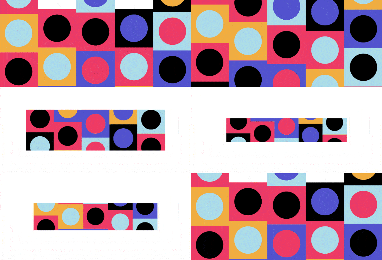
The visual sensation is produced by the different wavelengths of light. Colors can evoke emotions, set moods, and create a visual hierarchy.

The lightness or darkness of a color or tone. Values help create contrast, depth, and three-dimensionality in a design.

The surface quality of an object, either tactile or visual. It can be rough, smooth, glossy, matte, or have other characteristics.

The area or volume within or around objects. It includes positive space (occupied by objects) and negative space (empty or background space).

The three-dimensional representation of an object. It has height, width, and depth, and can be viewed from different angles.
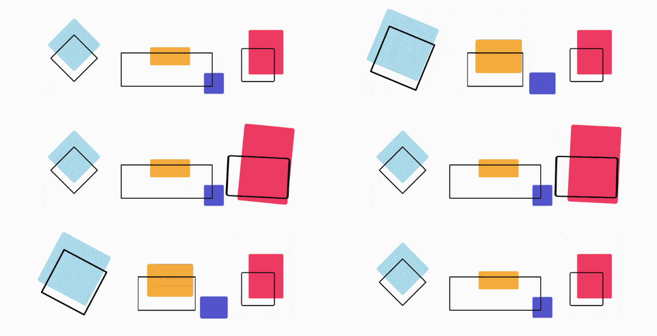
The dimensions of an object relative to other elements in the design. It can convey importance, and hierarchy, or create visual impact.

The art and technique of arranging typefaces. Different fonts, sizes, spacing, and styles can be used to enhance readability and convey meaning.

The distribution of visual weight in a design. It can be symmetrical (evenly balanced) or asymmetrical (unevenly balanced) to create different effects.
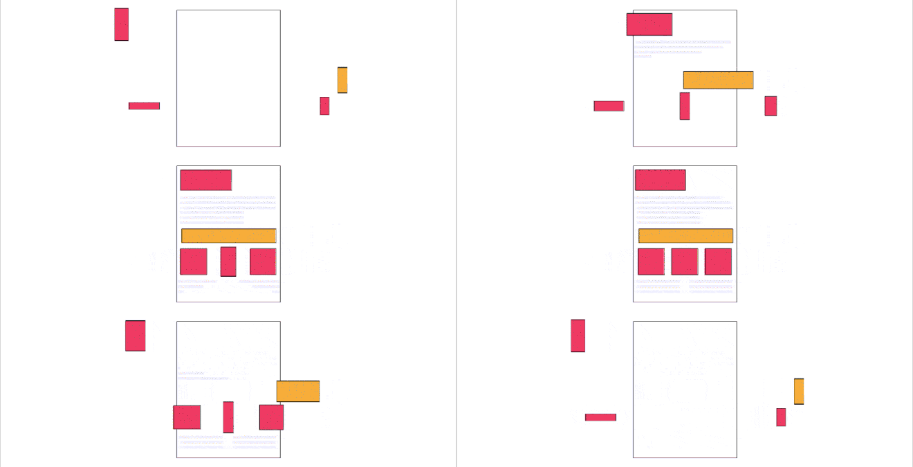
The overall coherence and consistency of a design. Elements should work together to create a sense of harmony and visual unity.

The juxtaposition of different elements creates visual interest and highlights important elements. It can involve differences in color, size, shape, texture, or value.

The element or area that attracts the viewer’s attention and creates a focal point in the design. It helps guide the viewer’s eye and hierarchy.

The visual pattern is created by the repeated use of elements. It can create a sense of movement, continuity, or organization in a design.
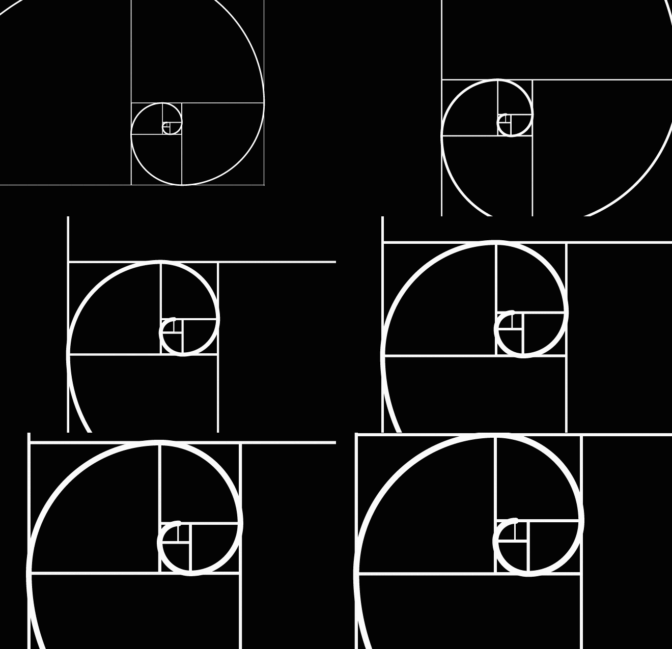
The relationship between the sizes of different elements. Proper proportion and scale ensure that elements are visually balanced and harmonious.

Well, a good designer always knows about these elements and if you are looking for a company to work wonders for your design-related tasks, BuzzFlick is the one to watch out for. It is among the best of the best design and animation companies in the USA providing high-quality and engaging design services.
Over 90% of businesses believe graphic design is essential for their branding and marketing efforts, highlighting how vital visual communication has become in today’s digital-first world.
A great design is always engaging, exciting, and compelling, just like a great story. It is powerful enough to change the minds of people. A good design opens people’s eyes and thoughts and lets them see new possibilities to inspire them and persuade them to take action.
Here are 15 of the most basic and structural elements of design that help you create the best visual story to communicate.

As one of the fundamental elements of design, the line is a vital component formed by connecting points. With its texture, direction, appearance, and weight, the line can evoke various moods and impressions. For instance, a straight line conveys balance and structure, while a curved line adds dynamism and artistic flair.
In design, there exist several types of lines, including vertical, horizontal, diagonal, and curved lines. Lines possess diverse characteristics such as smoothness, roughness, breaks, thickness, or thinness. They can also incorporate color, texture, and even movement.
Lines serve multiple purposes, such as dividing the content within your design or website, framing compositions, and offering a plethora of usage options. By skillfully employing the elements of design, particularly lines, designers can create visually engaging and impactful compositions that effectively convey their intended message.
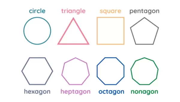
In the realm of design, shapes are geometric elements that play a vital role. These are actually spaces enclosed by lines. By combining various geometric and organic shapes, designers can visually narrate stories, depict real-life products, or evoke emotions. These shapes form the foundation for creating professional and visually appealing content.
To convey a sense of tranquility and naturalness, incorporating geometric shapes with rounded edges is recommended. On the other hand, if the goal is to captivate the user’s attention, employing sharp-edged shapes becomes crucial.
It is essential to recognize that every element on the design canvas is a shape. Therefore, comprehending how these shapes interact with one another is key before integrating them into a composition. By mastering the interplay of shapes as elements of design, designers can craft visually harmonious and impactful creations that resonate with their audience.
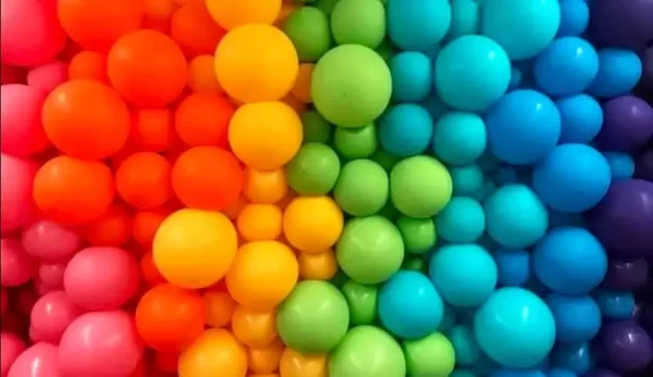
Color is a paramount element of design, exerting a profound influence on how viewers perceive visual aesthetics. The careful selection of colors establishes the desired mood, introduces contrast, and enhances visual allure, resulting in more visually pleasing designs.
Colors can be employed as solid blocks or layered as integral components of patterns, shading, and textures. They serve as effective tools for conveying information, evoking emotions, and highlighting crucial elements within a composition.
Colors can be categorized as warm or cool, light or dark, and saturated or muted, each possessing its distinct properties. When incorporating color in product designs, it is crucial to consider these unique characteristics to achieve optimal outcomes.
An understanding of color pallet theory is important for designers to use colors wisely in design. By understanding the potential of colors as elements of design, designers can leverage their transformative power to create captivating and impactful visual experiences that resonate with their target audience.
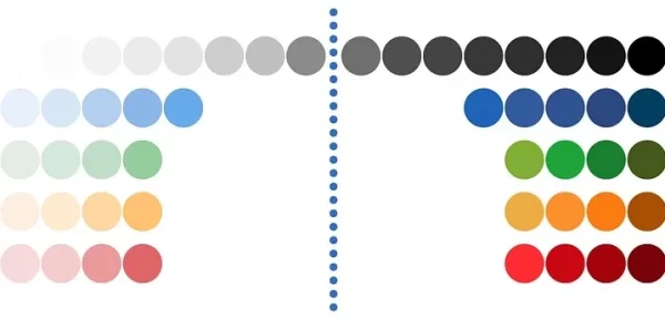
Value, an essential element of design, refers to the relative lightness or darkness of a color. It is achieved by incorporating white or black to alter the color’s intensity. Typically measured on a scale ranging from 0 to 100, higher values correspond to lighter shades. Manipulating the value of color holds significant value in design.
Adjusting color value allows for the introduction of depth and dimension within a composition. It facilitates the creation of dramatic contrasts and serves as a means to accentuate specific elements. By skillfully controlling the value, designers can imbue their designs with visual interest and enhance the overall visual impact.
Incorporating variations in value as elements of design offers a powerful tool for adding visual depth, emphasizing focal points, and evoking desired emotions within a composition. Harnessing the potential of value in design empowers designers to craft captivating and visually impactful designs.
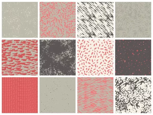
Visual texture, an essential element of design, pertains to the appearance and characteristics of a surface, providing insights into its composition. Similar to shapes, texture surrounds us and can be perceived through touch and sight, evoking sensations such as softness, roughness, or fluffiness.
While digital designs lack physical texture, they can simulate the tactile experience through visual cues. Incorporating texture breathes life, realism, and visual depth into design elements, lending them a three-dimensional effect.
However, it is crucial to select textures judiciously in graphic design. Irrelevant textures can fail to resonate with viewers, rendering them ineffective. Especially when you are an animation designer, you should master the skill to create relevant surface structures. You can learn skills and expertise required to become an animation designer and it will also involve texture studies.
Additionally, it is advisable to exercise caution when combining multiple textures within a single design. Overwhelming the viewer’s gaze with excessive textures can lead to confusion regarding focal points.
By leveraging the appropriate textures as elements of design, designers can create visually engaging compositions that harmoniously convey their intended message.
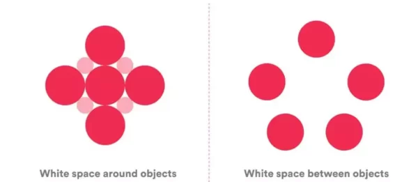
In web and graphic design, what designers choose to exclude is as crucial as what they include. Space, simply defined as the empty area surrounding a shape, plays a vital role in design. It serves to accentuate the focal point, enhance readability, and create visual harmony without overwhelming the viewer.
White space, also known as negative space, provides breathing room for design elements and improves visual hierarchy, guiding the viewer’s gaze through the composition.
Negative space refers to the area surrounding design elements, forming intriguing shapes that enhance the overall design. It helps define and highlight the positive space.
Striking the right balance between negative and positive space completes the composition, generating visual interest and cohesiveness. By skillfully utilizing the elements of design, including space and its variations, designers can create visually pleasing and impactful designs that effectively communicate their intended message.

Form in design refers to the three-dimensional quality and structure of an object or element. It is the visual representation of an object’s physical shape and occupies space in a composition. Forms can be organic or geometric, smooth or textured, and they contribute to the overall visual impact of a design.
The form is one of the crucial elements of design that adds depth, volume, and tactile qualities to a composition, going beyond the flatness of shapes. It provides a sense of solidity and presence, allowing viewers to perceive objects as tangible entities. Forms can be created through various design techniques such as shading, lighting, and perspective.
In essence, form in design brings a sense of realism, dimension, and substance to visual compositions. It plays a significant role in creating visually engaging and immersive experiences for the audience.
All professional designers use these elements to craft the masterpieces in design industry. If you want your design to work wonders for your brand or business, BuzzFlick is your safe bet. It is among the best of the best design and animation companies in the USA providing high-quality and engaging design services.

In design, manipulating the size of objects, shapes, typography, and other elements is crucial for creating visual interest and emphasizing specific aspects. Imagine how dull a symmetrical website with uniformly sized components would be! To avoid monotony, it’s essential to introduce variation, although the extent of it depends on the content.
Subtle differences in size are suitable for professional content, lending a refined touch. On the other hand, bold variations are well-suited for creative enterprises, infusing an element of excitement and energy.
By skillfully incorporating the elements of design and exploring diverse sizes, designers can craft visually captivating compositions that captivate viewers and effectively convey the desired message. Embracing these variations breathes life into designs, adding depth and visual intrigue to the overall aesthetic.

Typography encompasses the shape, style, and arrangement of text, influencing how it is perceived. Typography plays a pivotal role in design, as words not only carry meaning but also convey visual impact.
Just like color, texture, and shape, the choice of typography can tell a story, make a statement, evoke movement, and much more. Through typography, designers can communicate playfulness, professionalism, tradition, and creativity, or establish a distinct brand identity, differentiating between a high-end food store and a quirky knitting blog.
In graphic design, fonts are utilized to create cohesive sets of text, each with its own typeface design. One should know what fonts would be best for logo design, posters, or simply social media posts. Sans-serif fonts are often chosen for body text due to their legibility, while serif fonts are commonly used for headings and titles. Script fonts add a touch of elegance, and display fonts make bold statements, grabbing attention.
By skillfully manipulating the elements of design, particularly typography, designers can harness the power of words to enhance visual communication and create impactful compositions that resonate with their audience.
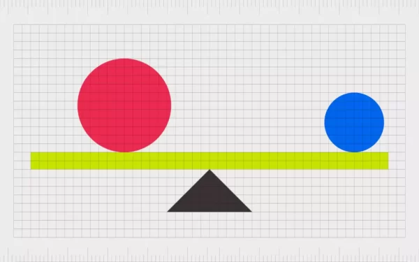
Balance, an essential element of design, pertains to the distribution of visual weight within a composition. The objective of any design project is to establish a sense of order and harmony, ensuring that all design elements cohesively work together. There are three distinct types of balance: symmetrical, asymmetrical, and radial.
By strategically employing the various types of balance as elements of design, designers can create visually pleasing and well-structured compositions that engage and captivate the viewer.
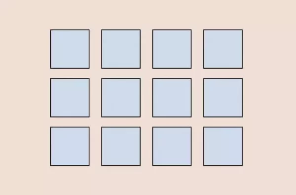
In design, achieving unity or harmony is paramount when creating a landing page, display ad, or mobile app. Harmony occurs when all design elements seamlessly collaborate to form a visually pleasing and cohesive whole. Failing to achieve harmony can result in a jarring experience for the viewer.
Contrast plays a vital role in attaining unity or harmony. It serves to direct the viewer’s attention to essential elements and produces visually appealing or intriguing effects. Techniques such as color, scale, layout, and typography can be employed to create and manipulate contrast within a design.
By skillfully utilizing the elements of design, including contrast, designers can cultivate harmony in their compositions, ensuring a visually engaging and seamless experience for the viewer.
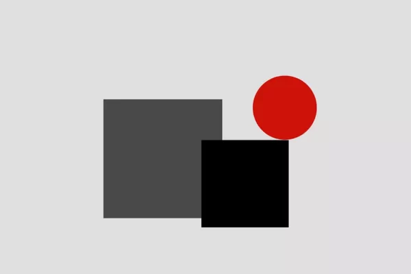
It is the juxtaposition of different elements to create visual interest and highlight important elements. It can involve differences in color, size, shape, texture, or value. Incorporating contrast in your design is crucial for highlighting a message, product, or idea effectively. Without contrasting elements or colors, your intended message may be overlooked by the audience.
Contrast can be achieved by incorporating opposite colors or utilizing different sizes of similar shapes. By juxtaposing vibrant hues or varying the scale of elements, you can create visual interest and draw attention to specific areas of your design.
By leveraging the elements of design, particularly contrast, designers can ensure that their intended message stands out and captures the viewer’s attention. Through the strategic use of contrasting elements, a design can effectively convey its intended meaning and make a lasting impact on the audience.
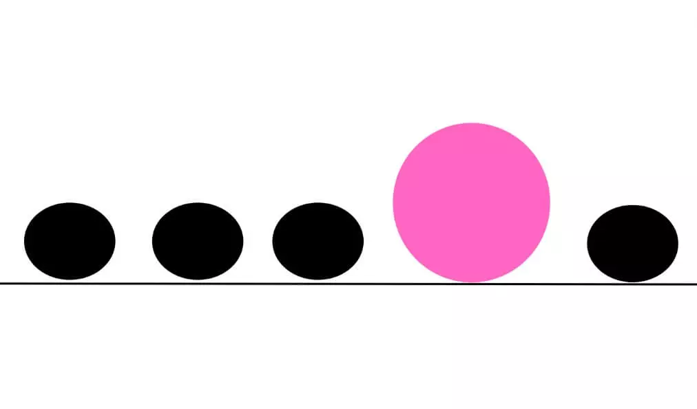
The element or area that attracts the viewer’s attention and creates a focal point in the design. It helps guide the viewer’s eye and hierarchy. In design, the element of emphasis plays a vital role in creating visual impact. By allowing an object, color, or style to dominate over others, emphasis introduces a heightened sense of contrast, which is both intriguing and attention-grabbing.
Emphasis is achieved by deliberately highlighting certain elements within a composition, creating a focal point that draws the viewer’s gaze and directs their attention. By strategically employing contrasting elements, such as bold colors, unique styles, or prominent objects, designers can effectively emphasize specific aspects and convey their intended message with clarity and impact.
Through the careful use of emphasis and other elements of design, designers can create compositions that engage the viewer, communicate their message effectively, and leave a lasting impression.
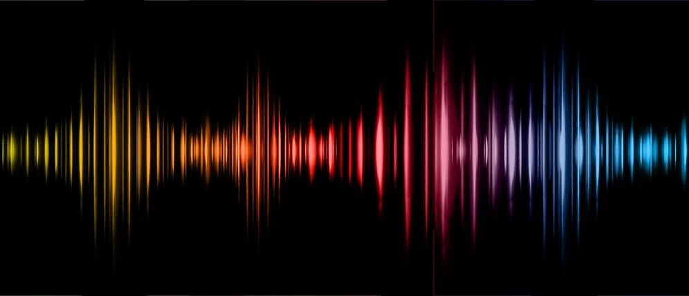
Rhythm, also known as repetition, is an important element in design that brings visual harmony and cohesiveness to a composition. It involves the deliberate repetition of design elements, such as shapes, lines, colors, or patterns, to create a sense of movement and continuity.
By incorporating rhythm in design, designers can establish a flow that guides the viewer’s eye and creates a sense of visual interest. It adds structure and consistency to the overall composition, enhancing its visual impact.
Rhythm can be achieved through various techniques, including repeating shapes at regular intervals, using consistent color schemes, or employing patterns that recur throughout the design. This repetition creates a rhythm that engages the viewer and provides a sense of familiarity and order.
By understanding and utilizing the elements of design, particularly rhythm, and repetition, designers can create visually captivating compositions that effectively communicate their intended message and captivate the viewer’s attention.
You can take it as the song beat. Repetition is used to form a stable rhythm. Similarly, rhythm in design is used in repetition to form visual mood and flow. Repetition in design is quite straightforward. You only need repeated elements to create it.
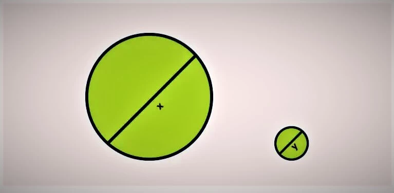
Understanding scale and proportion is essential in comprehending the relationship between objects, text, or shapes within a design. By purposefully incorporating elements of varying sizes, designers can effectively convey significant messages or concepts.
Thoughtful scaling and proportioning of each element allow designers to guide the audience through a visual narrative. By striking a balanced scale, they create a harmonious composition that promotes coherence and visual appeal.
By utilizing the elements of design, including scale or proportion, designers can craft engaging and impactful visuals that communicate their intended message effectively. Scaling objects appropriately not only adds depth and dimension to the design but also enhances the overall visual experience for the audience.
A great design is possible if you use these design elements wisely. BuzzFlick’s team of great designers knows really well how to use these elements wisely and strategically to produce outcomes par excellence.
In essence, the elements of design are the tools, building blocks, or raw materials you use to create any visual message, imagery, or design, much like a painter needs paint. From line, color, and space to shapes, form, and texture, a designer stack multiple elements to create visually impactful and effective messages to convey or enhance design features.
At BuzzFlick, we don’t just design; we craft meaningful visual experiences that tell stories, evoke emotions, and leave lasting impressions. Our talented designers and animators know how to apply every design element—from color harmony and typography balance to proportion and rhythm—to create visuals that are not only beautiful but strategically effective.
The elements of design are the core components of any visual design which include line, color, shape, space, value, form, and texture.
Line is the essential most of all elements of design. It is considered as the origin for all artistic expressions has more thickness and can be broken or unbroken, or implied. A line can be horizontal, vertical, diagonal, and even curved.
Elements of design are important as every object around us is created through them. Keeping elements of design in mind really helps in creating an effective composition that gives your audience a clear message. Without these elements, an effective outcome can not be expected. A good designer always works and produce effective outcomes by learning design elements and creating captivating visuals using design principles.

Get A Custom Quote Now
Get Video Animation at Reasonable Prices at BuzzFlick! Get A Quote!