- Author: Eich Eyf
Date: May 26, 2022 - Category : 2D Animation

Have you ever wondered about the power of color? What do you know about color’s ability to elicit a strong emotional response and draw attention to the artwork?
What role do the colors play in conveying the message you’re trying to get through in your animation? If you’ve never heard of the color script idea, we think you should learn more about it.
For Pixar, it’s a useful phrase that they’ve popularized, and it’s an early attempt to map out color, lighting and emotion, and mood in cinema. “The Art of Pixar: 25th Annie.: The Complete Color Scripts and Select Art from 25 Years of Animation” is a book dedicated to Color Scripts.
An introduction by Disney ex-pat John Lasseter, who worked at Lucasfilm’s computer graphics group, which later became Pixar after Steve Jobs acquired the firm in 1986, introduces the book, which was written by Cartoon Brew co-founder Amid Amidi.
In the early stages of a film, the color screenplay isn’t just about creating a beautiful piece of art; rather, it is an integral part of the plot.
It’s wonderful to take a breather from the high-resolution images of Toy Story 3 that have been released by Disney/Pixar.
Toy Story 3’s color script was written by Pixar art director Dice Tsutsumi, and it serves as a guide for viewers and animators alike to see how color arcs in a film connect to the narrative.
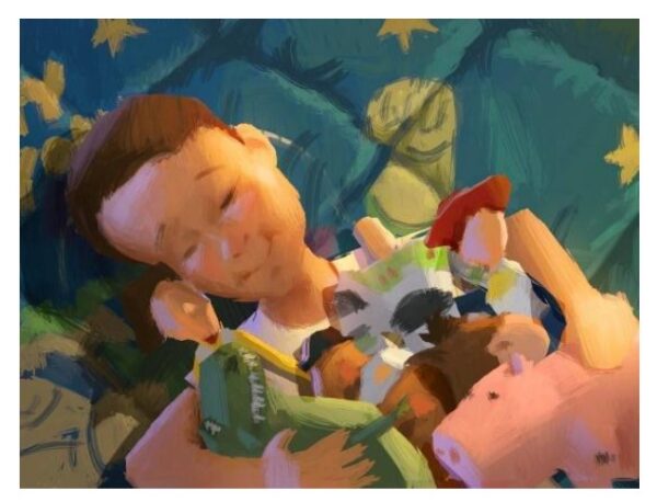
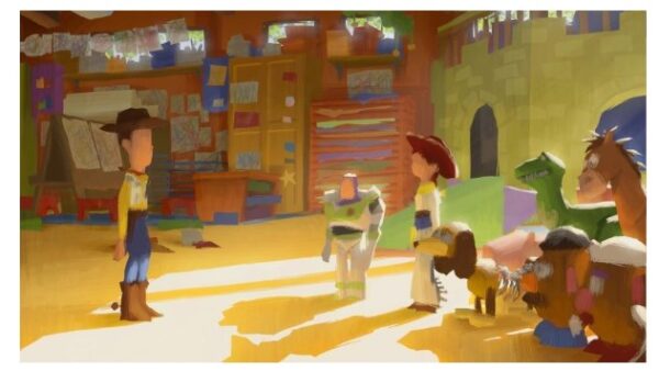
Why not challenge yourself to create a new color scheme every day in order to sharpen your skills?
The use of complementary colors in a movie’s visual design and how color schemes are chosen for a movie to keep it more appealing and give psychological aids is a science.
To begin, as you ponder the significance of color, consider the following:
White duck from the ugly duck animated film shows how colors may be utilized to direct a viewer’s attention to what’s most essential.
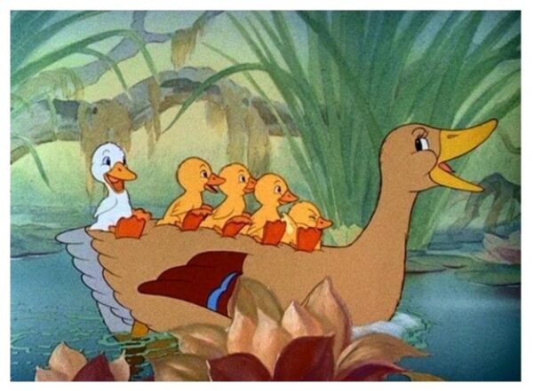
Colors can convey a narrative or drastically alter the tone of a scene, so it’s critical to get it right the first time.
When it comes to the importance of colors in animation, saturation and color value also play an important role.
An image’s color intensity is measured through color saturation. Technically speaking, it’s a way of expressing how wide a source’s light spectrum is. The color of the image is described by the term hue, whereas the term saturation relates to the strength (purity) of that color.
Whenever color is completely saturated, it’s regarded to be in its purest form. It is believed to be the most accurate representation of color since primary hues of red, blue, and yellow are completely saturated.
The colors look purer as the saturation increases. Colors become increasingly washed-out or pale as the saturation level lowers.
Related Reading:
The degree of brightness or darkness of a color is described in this way.
Stabilizing the color saturation while still emphasizing the colorful item is a delicate balancing act since saturated colors not only appear unreal but also encourage your eyes to wander around the image in search of relief.
As a rule, when it comes to cartoons, bright, vivid colors might actually work to your advantage. This is because viewers will be able to tell right away that they’re looking at something that’s not genuine.
To have a better insight into how these two terms work in the world of animation, let’s take a look at two popular examples:
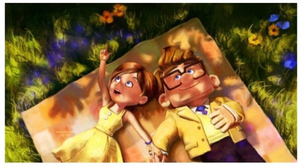
In this shot, you can clearly see how brilliant the colors are, which may have a profound effect on your mood. Several hues of yellow and orange were visible. The grass was glowing in the dark. This was supposed to represent a pleasant time in their life, but it subsequently turned into despair because of their circumstances.
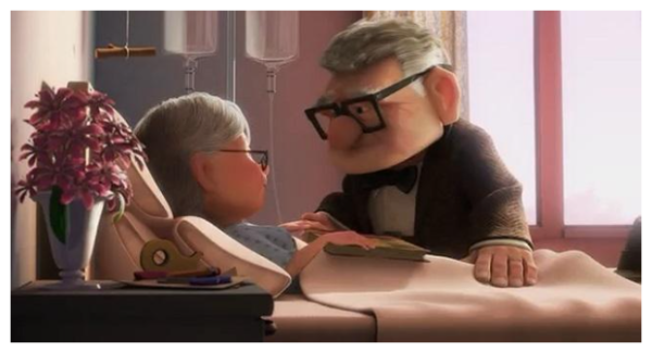
The palette shifted to muted, dark tones like grays and browns. That makes you feel the coldness and the loneliness that the characters are suffering.
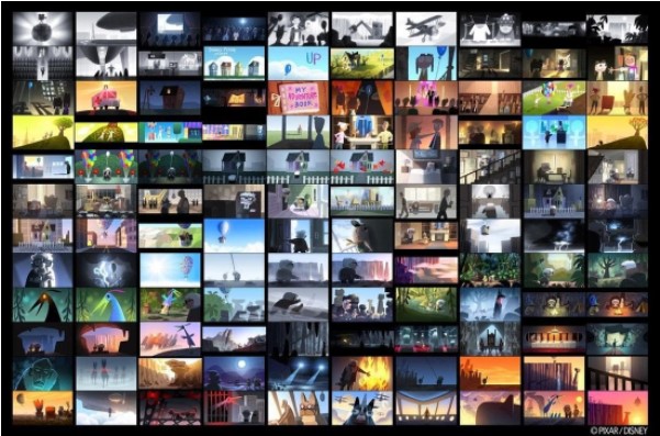
Source: Brain Bowes illustration
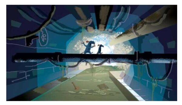
Production designer Harley Jessup likes to exploit the contrasting textures of different locations in the films he’s worked on, like Monsters, Inc., and Ratatouille. His color script for Ratatouille emphasized the damp underground sewers against the warm, rich tones of the human world that Remy yearned to be a part of. —Amid Amidi
To recapitulate:
As we already know, each color emits different emotions, and when two or three are combined together, they reflect different ideas, emotions, and messages.
Let’s take a look at some of the popular color combinations and what effects they illicit on viewers when it comes to animation:
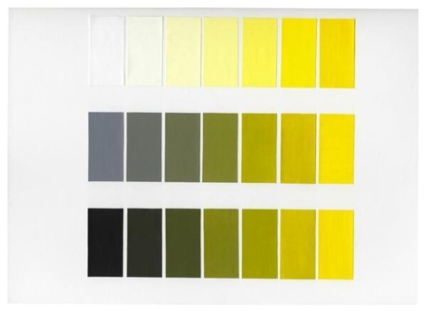
To create monochromatic color schemes, you start with a single color and build from there. The addition of white produces tints, whereas the addition of a darker hue, such as grey or black, produces shades and tones. This is not a monochromatic design in the true scientific sense.
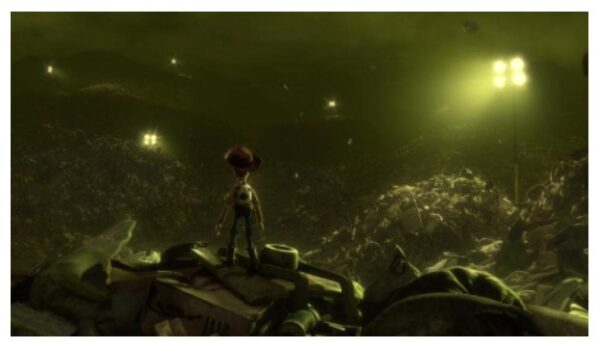
Only yellow and its gradation were employed in this toy film animation shot.
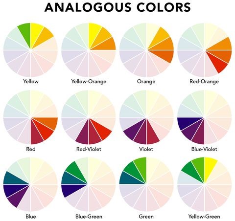
Yellow-green, yellow, and yellow-orange are examples of three colors on a 12-part color wheel that are analogous. It’s common for one of the three hues to take the lead. For example, red and green and red-purple and yellow-green are complementary hues since they are opposites.
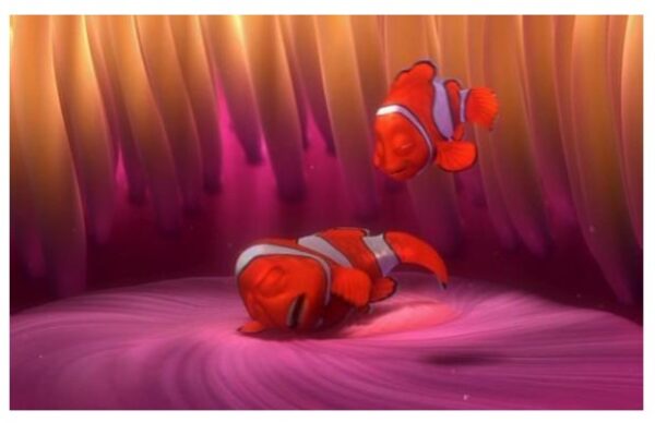
Pixar’s Finding Nemo film relies on Analogous by the three colors grading as seen in the image above (red, orange, and purple).
Source: Ellec Decor
Equitable distribution of the color wheel’s triadic spectrum is used in a triadic color scheme. It’s not uncommon for a triadic color harmony to be fairly brilliant, even if you utilize faint or unsaturated versions of the colors.
The colors of a triadic harmony need to be carefully matched such that one hue takes center stage while the other two serve as accents.
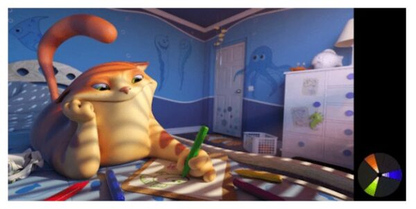
Colors like blue, orange, and a little green are used to create harmony in this image.
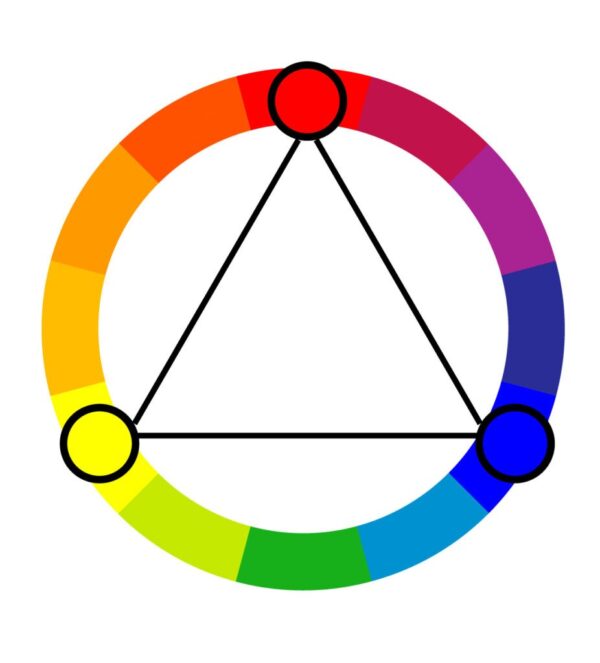
Source: Colors Explained
Complementary colors are those on the color wheel that are directly opposite each other (for example: red and green). Using complementary colors at maximum intensity gives a bright effect.
Manage this color scheme carefully so that it isn’t disruptive. It’s difficult to employ too many complementary colors at a time, but they work well when you need something to stand out.
Complementary colors are a no-no when it comes to typography.
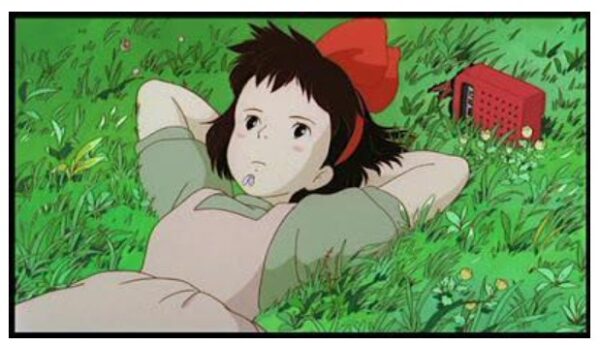
Only red and green, with their gradation, were employed in this shot.
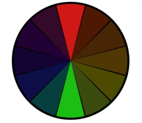
It is a version of the complementary color scheme that uses split complementary colors. Additionally, it makes use of the two hues that sit on either side of its complementary color. There is less tension in this color scheme compared to the complementary color scheme.
There is less tension in this color scheme, yet it still provides a strong visual contrast. As a rule of thumb for novices, the split-complementary color scheme works well.
Using red, blue, and orange as the primary colors, this figure achieves a beautiful equilibrium.
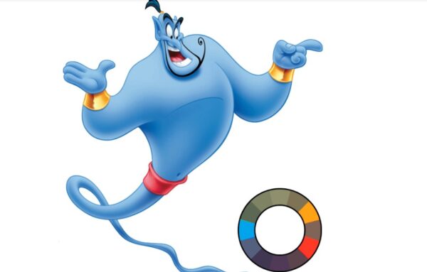
Unlike the rectangular color scheme, this one has all four colors uniformly spread around the color circle.
When using a square color scheme, it’s recommended to stick with a single dominating hue.
The harmony between warm and cold hues in your design is another something to keep in mind.

Understanding colors in animation can be a little complicated if you’re new in this industry. It will take you some time to get a firm grasp over it.
If you’re still in the learning process and need help with your animation video project, you can always count on us.
As one of the best animation studios in Vancouver, BuzzFlick offers various animation and production services. Just for your information, we have a dedicated team for each animation service we provide to our valued customers.
Each member of our team is highly skilled and competent enough to deliver top-notch quality products.
If you’re wondering which animation services we offer? We are offering all video animation services, including 2D and 3D animation services, cel animation services, cut-out animation services, and motion graphics services, to name a few.
So, what’re you waiting for? Ping our expert animators today!
So that was all about the significance, impact, and usage of colors in animation. Of course, animations can be monochromatic, but we all know who would like to watch black and white animated films in this century.
We hope this informative guide will be of great help to you. If you feel like there’s an idea that you can discuss, don’t feel shy; contact us today!

Get A Custom Quote Now
Get Video Animation at Reasonable Prices at BuzzFlick! Get A Quote!