- Author: Sophiea Ank
Date: Mar 30, 2022 - Category : Video Marketing

Visual storytelling has always been a part of human life. Whether to show human evolution, hunting ideas, treasure maps, or learning scripts, humans have used visual storytelling.
If we go back in time, Egyptians used cave paintings to communicate their stories to the people, and that is how the culture and stories moved from generation to generation.
In modern days, people still love storytelling and enjoy watching visual representations of the story. Even renowned brands and companies use digitalized visual storytelling to educate, build awareness, and motivate their targeted audience.
Various art and video production companies use technologies and software to create animated storytelling. Marketers highly recommend the use of visual and animated storytelling as the most effective marketing technique to reach the maximum audience.
This read will reveal effective tips and tricks that will help you with your marketing campaigns and boost engagement at your channel, website, and socials.
So, keep reading!
According to Eric Goodstadt (President at Manifest) and Sacha Reeb (Chief Creative Officer at Content Marketing Agency) definition, visual storytelling is used to drive interest among the audience and motivate them to perform specific actions through captivating videos and visuals images, art, and animation.
The definition has covered two essential elements of a perfect marketing campaign:
Storytelling must be powerful and convincing, and to make that happen, it must have five primary elements:
Here are excellent examples of perfect storytelling. Let’s see how the creators have implemented these vital elements in their visual art.
In 2016, The New York Times released top athletes’ video biography of those who represented the USA in the Rio Summer Olympics, and one of them was Simone Biles.
Through easy wins, athletes make their accomplishments appear effortless, making it difficult for the audience to comprehend and appreciate their effort and skill. Viewers get a detailed description of Simone’s remarkable gymnastic moves in this 3-minute storytelling.
Simone is seen sprinting toward the vault springboard, where the camera is placed right behind her launching spot. The audience hears an energetic track consisting of a series of high notes played quickly on the piano.
The vision flips at full speed as Simone approaches the vault and launches. Within the first 8-seconds, the audience is compelled (tension) and entertained (entertainment) to watch the story.
The on-screen shots rapidly shift to a sequence of Simone’s performance and landings on various pieces of apparatus in multiple venues as her feet land on the mat.
The plot thickens when the audience witnesses snippets of Simone’s talent in the competitions as a child and subsequently at world championships.
What clues does the audience have as to what they’re seeing? It’s explained in a brief overlay of text (education). It concludes that section of the story with Simone’s signature maneuver, The Biles.
The tension, education, and entertainment don’t go away after that. “Double layout with a half-twist and a blind landing,” says a text overlay over a sequence of scenes showing The Biles in real-time.
“I’ve seen some of my male friends do it, but they never land it, so they get really furious,” Simone says on video with a broad grin. (Her quote addresses the tension as well as the entertainment value.)
The storytelling continues for a few minutes more. Simone’s coach says in an on-camera interview that she can perform more single-pass on-the-floor exercises since then she doesn’t need as much running time to lift and launch.
Later in the video, the focus shifts to Simone’s unique abilities on the balance beam. She can perform movements that others can only execute on the floor and land in a way that no one else can (more tension, entertainment, and education).
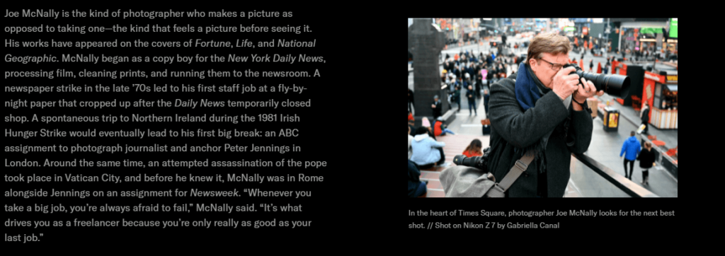
The microsite Areas of Focus is a one-page interactive photo gallery. It follows photographer Joe McNally, who was handed a Nikon Z 7 camera and spent time in New York City following a street performer and a bar to click aesthetic photographs.
The Atlantic’s marketing team planned and created the microsite, which Nikon paid to showcase their new professional camera as a substitute to regularly used DSLR cameras.
To set the scene, the narrative begins with the text: “McNally ditched his DSLR in favor of Nikon’s newest lightweight mirrorless and portable camera: the Nikon Z 7, which is ideal for the kind of hunt-and-seek shooting that got him started. For a week, we followed Joe about the city, checking out Nikon’s newest features in his trademark way.”
Professional photographers are the target audience for the microsite. Nikon and The Atlantic recognized that this audience is interested in learning how their peers create photos — the specifics of setups, settings, and so on. When visitors navigate the site, they will see this story portrayed graphically and in text.
Well-designed micro-interactions compliment this insider’s perspective.
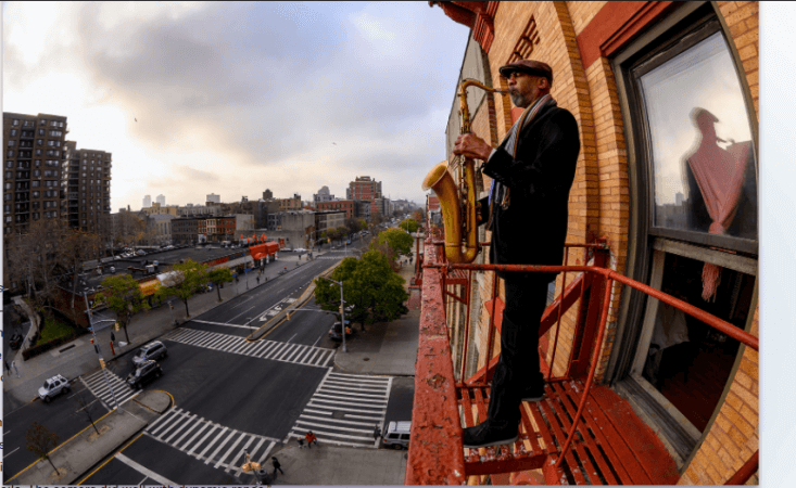
Here’s an example of a scene from the story:

Image Source: theatlantic
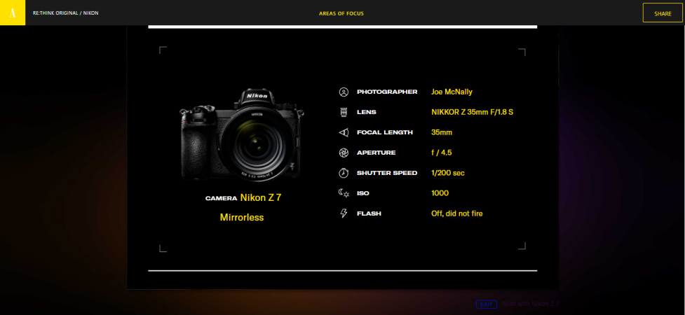
The shot’s camera parameters emerge when visitors hover their mouse over a label (EXIF Shot with Nikon Z 7) directly beneath the photo:

Image Source: theatlantic
Later in the week, Joe visits the Manhattan Cricket Club to put the camera’s mobility and high ISO (light-sensing) capabilities to the test:

Image Source: theatlantic
The plot returns viewers to the chief character of the week: the street musician. And as the photographer visits him at his house the morning after the Cricket Club outing, he captured this scene:

Image Source: theatlantic
As the musician’s story and the photography week with the Nikon come to an end, a new perspective on the photographer’s biography emerges.

Image Source: theatlantic
With the Nikon camera as the co-star, the website takes you on an exciting and aesthetically appealing tour across New York City and the happenings.
We have shared examples with you from well-known media companies and large corporations. You must be thinking that you don’t have a budget like The New York Times or Nikon, but it’s fine.
You don’t need a massive budget to make extraordinary visual stories and implement the five vital visual storytelling elements. You can create videos, write blogs, or perform video podcasts to feature your story and gain an audience.
Whether it’s your story or your business’s story, BuzzFlick is the perfect fit for you! It stands among the top video editing companies in the world.
BuzzFlick is a video animation agency that is an expert in animated storytelling. You can avail of their services like explainer videos, whiteboard animation, 2D animation, 3D animation, educational videos, and motion graphics to tell your tale to the world.
BuzzFlick has worked with hundreds of clients around the globe and has provided numerous successful projects within the deadline. The studio has won various animation awards and serves as the best animation studio in NYC. You can trust BuzzFlick with your time, money, and project.
Happy Animation!

Get A Custom Quote Now
Get Video Animation at Reasonable Prices at BuzzFlick! Get A Quote!