Throughout the centuries, “a picture is worth a thousand words” has been a guiding principle for the use of illustration in advertising. However, in this era when digital marketing is becoming, and video has become the undisputed king of content, many organizations are still using illustrations to market their new line of products or services.
For some, especially Gen Z, this term might but a new concept, but it’s been around for decades. Today in this blog, we’ll be exploring the meaning and significance of Illustration Advertising and some popular advertising techniques that can help you to stand out among your competitors.
So, without any further ado, let’s get started.
What is Illustration Advertising and its Significance in the Corporate Sector
Since it is only logical that potential consumers would want to examine the items before purchasing them, it stands to reason that illustration advertising would be among the earliest forms of marketing.
The tricky part is that 90% of the information entering our brains is visual. Furthermore, visual information is retained at a rate of 80%, whereas textual information is retained at a rate of 20%.
It follows that advertising illustrations were, are, and always will be a great way to advertise various items. Given this, it’s fascinating to study the tricks of the trade used by experienced graphic designers to influence viewers’ thoughts and feelings.
Popular Advertising Techniques Every Marketer Should Use
Bandwagon pressuring (FOMO), emotional appeal, endorsements, social evidence, and weasel phrases are some of the most often used commercial methods. The most popular techniques of advertising are discussed today, all 25 of them.
Composition
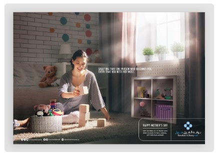
A well-balanced composition is crucial for every kind of image, just as the usage of color psychology is essential. The composition of an image refers to the overall arrangement of its constituent parts inside the frame.
Compositions can serve several functions, such as directing the viewer’s gaze to a focal point or establishing a horizontal or vertical rhythm.
A well-balanced composition can be achieved in a variety of ways. Gestalt principles are the foundational guidelines for creating striking visuals. Visual principles consist of things like “less is more,” “synchrony,” and “association.”
Color Psychology
Consider, for starters, how using particular colors might convey meaning. This method is standard practice in all forms of visual advertising.
It’s simple to misunderstand or incorrectly use the color psychology advertising tactic. Using a shade or tint of any hue other than the one intended might send the wrong message.
Branding components, including the backdrop, photographs, typefaces, visual accents, and even some of the writing, all feature prominently in a range of vibrant colors. That’s why you should always give some thought to the color scheme.
Think about the function of each hue and whether or not it is being used effectively. In order to get their point across without using words, creative advertisers use color. Using a bright color for a call to action button is one easy way to boost your website’s conversion rate.
Like Coca-Cola Red or Tiffany Blue, a single hue may come to stand for a whole brand.
The advertising below makes use of Tiffany’s signature blue hue and a minimalist black and white shot. The model is also making eye contact with the audience. We’ll go back to that in a while.

Helpful Readings:
Focal Point
Focusing on a central element is as crucial as picking the right colors and fonts. For advertising to be effective, there must be a focal point for the spectator to concentrate on.
There are several strategies for creating a focal point. Both the rule of thirds and the golden mean are helpful guidelines for establishing an effective focus of interest in a composition.
Other methods to determine a focal point include:
Light Source: Exclusively illuminate the focus point.
Selective Focus: Focus on the subject while blurring the surroundings, or vice versa.
Exposure: Manipulate an image’s dark and bright parts to make the subject stand out.
When there are two focus points, you can establish balance by applying Gestalt concepts. Where the letters have been wiped out, the prominent focus areas of the advertisements below are highlighted.
Rule of Thirds and The Golden Mean
In addition to the Gestalt principles, designers apply two more strategies to produce visually harmonious commercials. The rule of thirds and the golden mean are these concepts.
The rule of thirds and the golden mean are visual techniques that assist designers in arranging components in space in an aesthetically pleasing manner.
The rule of thirds divides the canvas into six equal rectangles, consisting of two rows and three columns. By positioning significant items at the intersections of the rectangles, they are given visual prominence while preserving visual equilibrium.
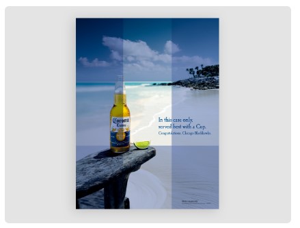
A golden mean is a visual tool based on the Fibonacci sequence’s ratio. Akin to the rule of thirds, the golden mean is a method used to position parts in a harmonious manner.
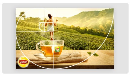
It is up to the photographer, filmmaker, or designer to decide which tool to use.
Visual Path
Similar to the focus point, a visual route directs the eye from one part of an image to another. The reader or viewer is led on an adventure through the material presented here.
The eyes of the viewer will naturally move along a predetermined path whenever they see any visual representation, be it an advertisement, a magazine page, a website, or a landing page.
Generally speaking, there are two basic forms to consider when discussing visual routes. The first is a Z form, in which the eyes go from the top left corner to the right, then down and left, and finally back across to the right.
The second form we encounter is an F. Unlike the Z, which curves back to the left on a downward diagonal, the F is drawn in a straight line that mimics the way we read paragraphs of text.
See an example of the Z visual route in action on the landing page below. The header draws our attention, and then the face of the man (notice his body language), the button, and finally, the mockup of a mobile phone.

Typographic Composition
The use of typography is another crucial visual device. Any good visual commercial will include typography in some way.
Strike a good chord between images and typeface. Fonts, or typography, have a dual duty in communicating a message visually and verbally.
Font pairing, the practice of combining different typefaces, is crucial to the success or failure of a design. The backdrop color should go well with the colors of the text and letters.
Using typographic approaches, you may do things like make the letters take the form of shapes or embed textures within the letters.
The density of text in some contexts, such as Facebook advertisements, is crucial. There is a certain amount of text-to-picture ratio that can be submitted with advertising on Facebook before they are rejected.
Creators should be aware of the amount of text they provide, ensuring sure the image conveys the intended message without overwhelming Facebook’s system.
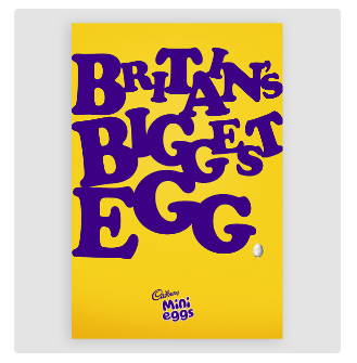
However, typography may serve as the primary focus in more conventional forms of advertising. See, for instance, this Cadbury commercial. To put it another way, the item they are selling is little.
Body Language
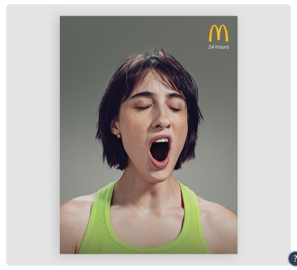
A vast number of graphic advertising assets feature humans in them. In both video and static graphics, the body language of the person – or persons – is highly significant.
A person’s body language can convey a wealth of information about their mental state, from their level of confidence to their level of expertise or achievement.
One’s posture, facial expressions, and movements all contribute to nonverbal communication, known as body language. The way a character moves or stands in a graphic is crucial, regardless of whether they are a model, actor, famous professional, everyday person, or animated figure.
The steps to achieving perfect body language in advertising start before it’s even developed. The proper messaging is decided upon by the creative director in collaboration with the client.
The next stage is to hold a casting call to identify an individual who can effectively convey the desired body language. Directions are provided to the actor or model during the session to get the desired result.
You’ll undoubtedly yawn at the below McDonald’s commercial since it relies only on body language to convey the idea that they offer 24-hour service.
Repetition
Repetition is a marketing approach that may be implemented inside an advertising campaign. Multiple facets of visual advertising use repetition.
Here are some examples of how it can be put to use:
- Throughout the day, on many different channels, play an ad on television.
- Put the same advertisement in many specialty publications.
- Don’t be afraid to use the same ad on billboards all around town, the country, or the world.
- Post your digital adverts on media platforms like Mediavine and Google Adwords.
- Get your brand’s assets printed on a ton of stuff and get it out there.
- Create several variations of the same advertisement using various actors and staging.
- Raising the maximum number of times you may see the same Facebook ad is one way to do this.
When promoting a new product or campaign, repetition is an effective strategy. Repetition helps spread the word at first, but after that, it should be toned down so as not to bore the consumer. Overuse of the same phrase or expression can become tedious.
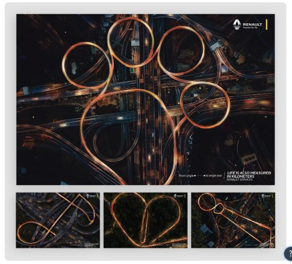
Below is an example of an advertisement for Renault that makes use of form repetition to convey the same message.
Point of View
This kind of advertising creates the illusion that the spectator is participating in or experiencing the action being shown. This method is commonly seen in online video commercials.
Different facets of the point-of-view method can be explored. SteadyCam allows a camera to be mounted at or near eye level, creating an immersive first-person experience for the viewer.
One more widespread application of this method is the use of GoPro cameras mounted on adventure sports helmets. The recorded content is then used in social media ads or extended motivational videos. These two companies, RedBull and GoPro, are masters of this method.
The lifestyle is what they’re selling, even if their movies don’t seem like a typical RedBull or GoPro commercial.
Direct Gaze
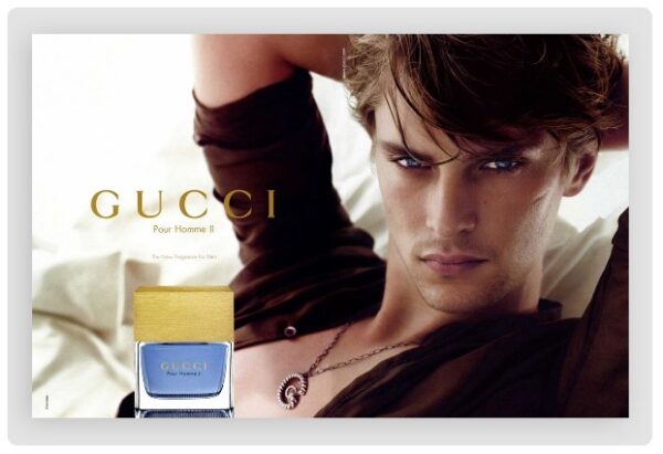
Similar to how advertisers often target us through our bodies, they often use eye contact to sell products. When someone stares you in the eye without averting their sight, they are engaging in a direct gaze.
This strategy was adapted from hypnosis. The purpose of this method, formally known as “gaze induction,” is to elicit an emotional response from a person just by looking at them intently. This method of advertising is quite efficient.
Advertisements for wristwatches and fragrances frequently employ the direct stare method in print media. Famous people, especially those who are widely regarded as attractive, play the lead roles in these stories.
Take this guy from a Gucci fragrance ad as an example.
Three-Quarter Gaze
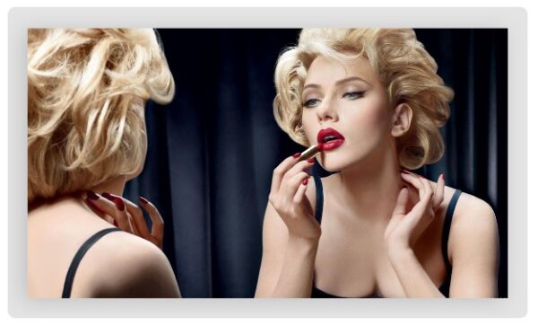
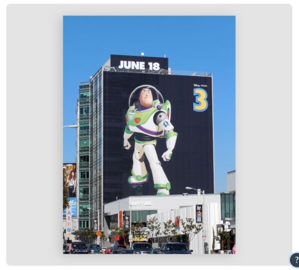
The three-quarter stare is another method for conveying character. Any orientation, within or outward, can be employed for the gaze. Message requirements dictate the course of action.
A viewer of the first scenario may feel as though they are “looking into” the action from the outside. This method frequently appears in videos. A static image that aims to convey awe is best served by the forward-facing three-quarter stare.
Dolce & Gabbana’s below commercial takes advantage of the three-quarter stare by having the model look into a mirror.
Another popular example is from Toy Story 3 billboard Buzz Lightyear.
Behind-the-scenes (BTS)
Communicating with clients effectively requires letting them in on the inner workings of the business. Creative behind-the-scenes photos and videos are a great way for a company to connect with its audience on social media.
Pictures or videos of the workplace environment where the things that clients adore are made might be used. An effective visual advertising strategy, “behind-the-scenes,” can help users feel more connected to the business.
Allowing a key employee to “take over” a social media channel is another fantastic concept that happens behind the scenes. This method of utilizing influential people inside an organization is a fantastic example of influencer marketing.
The new manager can use the company’s Visme team account and brand kit to share images, videos, and graphics. Some advertising companies provide this service and have trained staff members to carry it out effectively.
Customers like transparency in marketing and welcome an inside look at the making of a campaign. That’s because they see parallels between the team’s day-to-day activities and their own work lives. Whether you’re selling to businesses or consumers, a little personalization may go a long way.
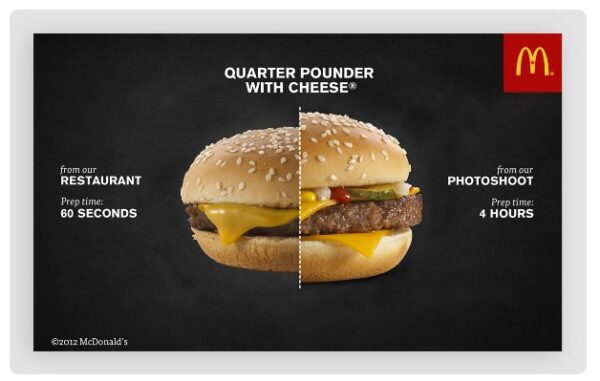
This McDonald’s burger photo was published alongside a movie showing how the fast food chain makes its TV advertisements.
Association
Some types of advertising heavily rely on appealing to people’s mental processes. One such method is “association marketing,” often known as the “association strategy.”
Assumption: the viewer will make connections between unrelated concepts thanks to the graphic’s imagery. A person may be reminded of a certain thing because of a mood, idea, location, or even just plain old nostalgia.
For association marketing to be effective, it is important to first learn as much as possible about the target audience before deciding on any particular associations to make.
Commercials for antibacterial hand soap, for instance, may feature happy, muddy children having a blast in the rain. This sends the message that being dirty is fine as long as there is soap and water to clean up afterward.
The association approach is also frequently used to advertise high-end items. People are encouraged to believe that if they buy an expensive wristwatch, they would be able to afford private aircraft and endless bottles of champagne.
When executed properly, these forms of associated advertising may be quite effective.
This drug-free Carnaval commercial is a masterclass in not just association but also color psychology, typography, and pure imagination.
Because of its association with video games, the sight of a female puking while dressed in costume is no longer revolting to today’s youth.

Symbolism
To some extent, the symbolism may be approached using an approach analogous to the association. Symbolic visual marketing strategies demand the employment of metaphors and similes to convey the intended meaning. These literary devices are employed to draw allusions and analogies in a piece of writing.
A hand cream’s advertising campaign, for instance, may include a visual metaphor that compares the cream’s aroma to that of spring blossoms.
Symbolism can be either nebulous and subtle or overtly fantastical, depending on the writer’s intent. The second strategy is effective only for well-established businesses with strong existing consumer loyalty because nobody intends to create chaos.
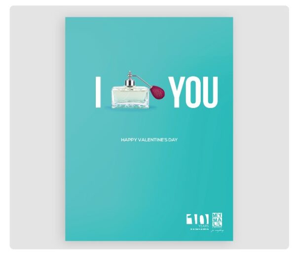
The love symbol is replaced with a perfume bottle in this print ad. In this context, a bottle of perfume might be seen as a representation of the heart or a token of affection appropriate for Valentine’s Day.
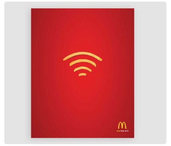
McDonald’s symbolic use of french fries to promote free WiFi is another excellent example. This advertisement makes use of the fact that virtually everyone is familiar with the WiFi sign
Emotional Appeal
Marketing strategies that appeal to consumers’ emotions are among the most successful. Anyone who has emotions is the intended readership. This method is frequently employed in commercials aired on television.
The really touching “Hallmark Commercial” is a good illustration. The use of symbolism, association, and complex narrative strategies are also crucial to the success of advertising that relies on emotional appeal.
This form of marketing can only be successful if the brand has an in-depth understanding of its target demographic. The marketing staff must have an intimate familiarity with the hopes, anxieties, and necessities of its demographic.
They may appeal to a wider range of clients by employing storytelling strategies that make them feel like they’re part of the tale.
Thai television ads have created a name for themselves internationally in recent years because of their touching messages. Some of these instances present the product as an afterthought to a heartfelt narrative.
It’s no secret that this commercial for Thai Life Insurance has gone viral online.
Anthropomorphism
Anthropomorphism is a marketing strategy that gives us talking M&Ms and peanuts with walking sticks. The goal of this strategy is to give a static item lifelike characteristics such as the ability to walk, talk, or even sing.
Brands typically produce merchandise featuring the ad’s character once its introduction becomes popular. If consumers take to the protagonist, he or she might one day be a household name.
Advertising has traditionally made use of anthropomorphism in its campaigns. The addition of limbs and legs to peanuts or the standing of a tiger on two legs are examples of well-known, simple methods.
This method is not in decline; rather, it has had a number of revivals in recent years. The Geico Gecko is a great illustration of this.
The Moscow Zoo has also indulged in some anthropomorphism for comic effect.
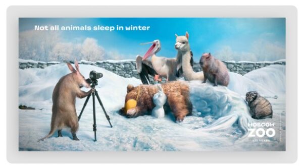
An illustration depicting an anteater snapping a shot of several other creatures.
Storytelling
Advertisers employ a wide variety of channels to bring their products in front of consumers, as we have seen. Of course, nothing beats the impact of a good narrative.
An effective advertising campaign not only creates a desire for the goods but also tells a story that the target audience can identify with. Technically speaking, storytelling is dependent on many of the other forms of advertising that are discussed in this piece.
You’ve probably seen the same type of story countless times in conventional media, which dates back decades. This method has been used well in the past.
There are several avenues open to a company in telling its story. It can draw on its own history or draw parallels with other areas, such as encounters with actual customers. A brand’s message may also be told through music and appropriate visuals without any spoken word whatsoever.
The primary characters in this TV ad for Lacoste communicate with one another over the years while always donning Lacoste clothing.
Bandwagon Pressuring
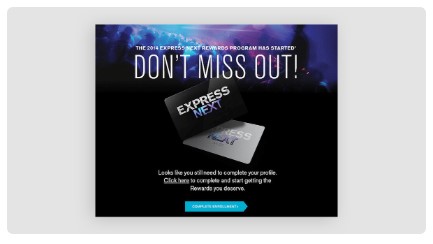
Bandwagon pressure is another human-centered method of advertising. When marketing a product, companies often use clever words to make readers feel like they’re missing out on something everyone else has.
The psychological strategy of FOMO (the fear of missing out) is central to this method. Creative methods sometimes include the use of the art of persuasion in order to get others to jump on the bandwagon. Subtly carved catchphrases are a potent tool for this method.
This strategy is frequently employed by multi-level marketing firms and pyramid scams. Every salesperson tries to persuade potential new customers that they are missing out if they don’t buy the goods.
Like repetition, too much bandwagon pressing may be counterproductive.
Below is an advertisement that uses sexually explicit language in order to make its target audience feel left out.
Social Proof
Although social proof can be employed to an extent in print ads, it is used primarily in online marketing.
Utilizing the power of social proof is easy when you combine influencer marketing with endorsements. They essentially act as brand ambassadors, advocating the product to their respective audiences and so generating sales for the company.
Case studies from existing customers are another kind of social proof. Articles like this may be found on the company’s blog and provide a concrete example of how the product was put to good use by a genuine customer.
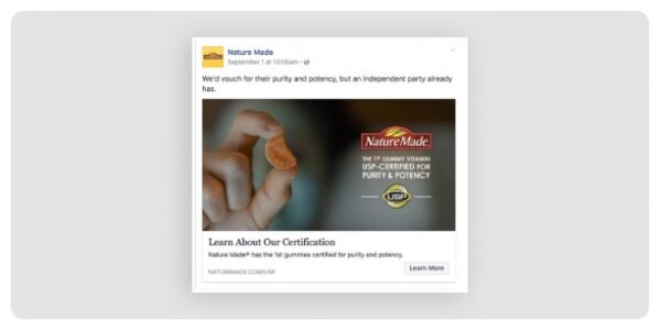
Visually incorporating social evidence into a display ad, email newsletter, billboard, or brochure is also possible with the help of social badges.
Testimonials from satisfied customers also qualify as social evidence. Either a website’s testimonial section or a full-scale video ad might benefit from these.
For their social proof technique, Nature Made includes a badge in this post.
A Facebook post’s snapshot demonstrates the product’s accreditation as a NatureMade vitamin.
Motion Graphics & Animation
Motion graphics and animation are rapidly becoming the norm in all forms of marketing communication, from online to billboards.
Animation refers to images that are computer-generated rather than shot with live actors. In other words, it’s a moving picture of a metaphor. To put it another way, a motion graphic is not a kind of narrative but rather an explanation or visual accent.
Both are utilized in the brief commercials that play before videos on YouTube or within applications that provide in-app purchases. This method is effective because it quickly grabs the audience’s attention.
This TV spot for Oreo cookies, which features an animated character, is charming, funny, and highly effective.
Fantasy
The use of imagination, like the association approach, is an effective psychological resource for visual advertising.
The idea that unicorns fart rainbows is a popular one amongst customers everywhere. Commercials for television and print media have also been known to take creative cues from films like The Lord of the Rings and Star Wars.
Ads with a fantastical theme are aimed toward fans of science fiction and fantasy media. There will be a long-lasting impression of the brand thanks to this strategy. Ads aimed at either children or adults can benefit from this strategy.
Artificial Reality (AR)
The emergence of augmented and virtual reality has led to a surge in interest in advertising that engages users in a two-way conversation (AR). Many popular TV shows have created augmented reality apps so that viewers can interact with the worlds they see on screen.
Due to the lack of overt sales pitches, this form of marketing goes by the name “covert advertising.” Instead, the focus should be on spreading the word of the brand’s underlying concept.
Keep in mind that all augmented reality advertising methods require some sort of software in order to function.
When it comes to augmented reality marketing, companies can and do get pretty innovative. For their storefront windows, Timberland, for instance, put in life-size screens. The purpose of this augmented reality app is to give users a virtual preview of how they would look while wearing Timberland products.
The app takes a picture of the user in front of a window and then dresses them up in various Timberland outfits. There was little work required from the user in this augmented reality dressing room.
Other augmented reality strategies include in-app purchases and 3D visualization of objects in a user’s area before making a purchase. Take the IKEA app featured in the following commercial as an example:
Social Media Influencers
The use of social media influencers, in which the influencers themselves generate the material to be shared, is the third method of visual advertising on the list.
There are businesses that give influencers complete creative freedom, while others provide them with a set of standards or visual styles to adhere to. It’s important to be genuine and personable while engaging in influencer marketing.
In this way, influencers may help brands reach consumers who are most likely to be interested in their endorsed products. They might execute a sales campaign on their social media platforms or make videos comparing their goods to those of competitors.
In exchange, brands might provide influencers with a pay-per-click or affiliate account, or they can negotiate a flat rate for sponsored content.
It’s not unheard of for a major company to reach out to a regular individual with a modest fan base and ask them to represent the company as an influencer. This subset of influencers is known as “micro-influencers,” and they often generate as much if not more success and interaction as larger accounts with millions of followers.
Unfinished Ads
Unfinished commercials are a form of visual advertising that has shown to be quite effective. Even though this isn’t a half-done commercial, it illustrates how the promises made in ads may often leave the reader feeling unsatisfied.
This tactic is commonly employed in advertisements when a business claims that its product or service is superior to the competition without providing any supporting evidence.
Here’s an advertisement from the mattress manufacturer Casper: “Unbox Better Sleep.” The company makes a blanket claim that its mattresses are superior without specifying which competitors they prefer.
Bribe
It’s probable that you’ve witnessed bribe advertising more often than you’d care to admit.
Offering a “buy one get one free” promotion, 20 percent off all orders over $100, or even free delivery is all it takes to convince a viewer to make a purchase.
The following advertisement for Payless is a perfect illustration of the concept.
Useful Reading:
Ready to Invest in a Video Advertisement? – Contact BuzzFlick
Apart from illustration advertising, video advertising has gained a lot of popularity in a few decades. Previously, we only used to see video ads on television, but now you can see them all over social media.
As video content has become the undisputed king of content, the need for it is massively increasing. Also, with the arrival of animation in the corporate sector, businesses are investing in animation more as animated videos are way more engaging and interesting.
If you want to get your video ads animated, then we’re here to help. As one of the best explainer video companies, BuzzFlick offers quality and budget-friendly video animation and production services.
We offer various animation services, including:
2D and 3D animation services
Motion graphics services
Custom whiteboard animation services
And now, NFT design services too
Also, if you’re wondering how much an animated video advertisement can cost you, try giving a read to our animated video cost guide or reach out to animation experts to get a free quote.
It’s Your Turn Now, Pals
The proliferation of digital technology has resulted in a meteoric rise in the prominence of visual forms of advertising worldwide. Color psychology and the use of direct eye contact are just two of the many effective advertising approaches that will never go out of style.
Your intended message should be carefully considered when deciding on graphic advertising methods. Avoid becoming too fancy with your own visuals; instead, keep the end user in mind at all times.
Get in touch with a professional designer who is up-to-date on the latest trends in television advertising and augmented reality app development if you want to make a greater splash.
There is plenty of online digital content creation software. Visme is one of them. It’s a useful program for making eye-catching marketing content. With their library of premade layouts, free fonts, images, and more, you can make any kind of visual graphic you can imagine.
You can use various other online video and illustration-making software for this purpose.
On this note, we end our comprehensive blog on advertising techniques. We hope you would have enjoyed reading them.


